An End to Dead App Design
Borges had a philosophy that emphasized writing no more than absolutely necessary—anything beyond that, he believed, was a waste of time and a disservice to the reader.
I also try to hold this quote by Pessoa in my head at the same time:
What is there to confess that's worthwhile or useful? What has happened to us has happened to everyone or only to us; if to everyone, then it's no novelty, and if only to us, then it won't be understood.
This extends to product design as well. I’m fatigued by the presumption that companies possess hidden knowledge about users—knowledge they can somehow unlock better than anyone else. When it comes to mobile apps in particular—the only area where I feel I have even the slightest authority to speak—we are wasting our time.
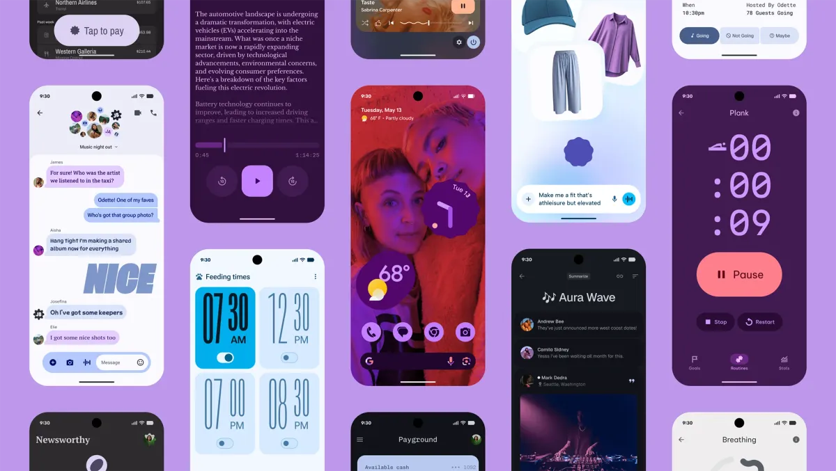
Google Updates Material Design
Material Design Expressive was announced today. An iteration on their already impressive Material Design guidelines.
This is like crack to me. It is correct, and deserves to be taken seriously.
I try hard to be sympathetic to the various ways companies feel compelled to stray from established best practices in the name of differentiation. I’m not well suited to that mindset, but I try.
Material Design is the single best mobile design system for bringing personality to a user’s experience. Yet companies reject it because it conflicts with their brand. And I know this because there are basically no apps that support these features.
Hear me out:
What good is your brand if a user’s home screen can be tailored to look this incredible, and then they open your app and it looks like it’s from an alternate reality? At that point, your brand becomes “not getting it,” and you miss the very objective you set out to accomplish. Users deserve to be delighted—not just by some unique experience, but also by consistency, simplicity, and predictability. These design systems, especially Google’s, make that possible.
Why, and For Whom?
I’m going to write more about this in the future, but one thing I still can’t wrap my head around is: who is this for? Why would anyone choose not to adhere to a system like the one Google is presenting? Why are we making these choices?
Brand doesn’t have to be a color. It can be a show of respect. It can be the feeling that we cared deeply about the person who would hold a phone and open our app—that we felt privileged to have a place in their pocket.
And yet, I still end up with more questions than answers.
The Future Seems Brighter
The good news is that boring, flat, impersonal design trends finally seem to be dying after more than a decade. It gives me an opportunity to advocate and test whether I’m up to the task of communicating why any of this matters.
I like change. I like a challenge. And I hope this trend continues.